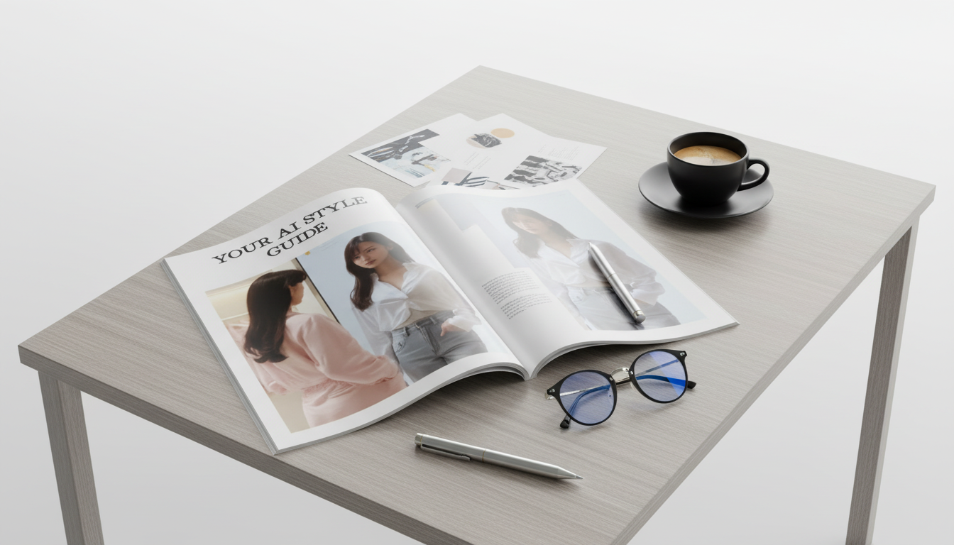
A signature style is easier to spot than to define: it’s the repeatable mix of words, visuals, and decisions that makes a brand feel unmistakably “you.” When AI enters the workflow—drafting captions, brainstorming headlines, assembling mood boards, or speeding up layouts—that signature can blur fast unless there are clear guardrails.
Your AI Style Guide digital workbook turns the fuzzy idea of “brand vibe” into a practical 3-step checklist. The goal isn’t to restrict creativity—it’s to make consistency effortless across every touchpoint, even when multiple tools (and multiple people) are creating content.
Signature style isn’t just a palette and a logo file. It’s a system of defaults that helps you make the same kinds of choices again and again—so customers recognize you instantly.
| Component | Common examples | Where it should match |
|---|---|---|
| Voice | Short sentences, warm authority, specific verbs | Website copy, emails, captions, product descriptions |
| Visual system | 2–3 core colors, 1 headline font, 1 body font | Site, graphics, lead magnets, thumbnails |
| Imagery rules | Lighting style, backgrounds, cropping, filters | Photos, reels covers, ads, shop listings |
| Message pillars | 3–5 repeatable themes | Content calendar, launches, bios, about pages |
| Do/Don’t list | Avoid clichés, avoid overly formal phrasing | Everything published (including AI drafts) |
AI is fast, but “fast” can look like “generic” when style isn’t defined first. Most tools default to widely used phrasing and predictable structures unless they’re constrained.
For a deeper look at how tone choices affect user trust and clarity, Nielsen Norman Group’s guidance on tone of voice is a solid reference point.
Start with the “why” behind your style. The aim is to name what should stay steady, no matter what platform you’re on.
If visuals are part of your brand presence, it helps to align typography decisions with a clear hierarchy. Google’s overview of typography systems is a useful model for thinking in rules, not one-off choices.
This is where signature style becomes easy to apply. You’re not trying to document everything—just the defaults that keep output consistent.
When product copy is part of your brand, consistency shows up in small details: how you describe fit, how you name colors, how you balance benefits with vibe. For example, if your tone is “clean and confident,” your descriptions for items like the Women’s Cotton Printed T‑Shirt and the Sexy Halter Backless Print Maxi Dress should share the same cadence, the same level of detail, and the same kind of CTA.
For a practical overview of what style guides typically include, Adobe’s explanation of brand style guides offers a helpful baseline.
To make this process quick, keep everything in one place. The most efficient setup is a one-page “single source of truth” plus a short style snippet you can reuse for product descriptions, emails, and captions. That’s exactly what Your AI Style Guide digital workbook is designed to help you build in one sitting.
Even small consistency upgrades—like standardizing how you describe materials, fit, and care—can make a shop feel more “intentional.” Pair the guide with a few real listings (such as the Calvin Klein Jeans Women’s Beige Trousers) and rewrite one description using your new rules as a quick proof of concept.
Yes. It starts from scratch with guided prompts and examples, so you can make clear decisions without overthinking. The checklist format helps create simple defaults you can apply immediately.
Yes. The output is tool-agnostic: a set of rules plus a reusable style snippet that can be pasted into most chat, writing, or design tools to keep results consistent.
About 60 minutes for a solid first pass. After that, it’s easy to refine over time as you learn what resonates and your brand grows.










Leave a comment